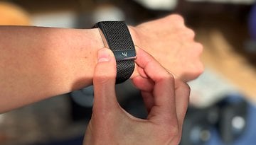
I Didn’t Expect to Like Wear OS 6—But These 5 Changes Won Me Over

Wear OS 6 finally nails what a smartwatch user experience should feel like on a compact display. At Google’s developer conference, several key UI overhauls were unveiled—subtle in some places, bold in others. And while AI stole the spotlight at this year’s I/O, Wear OS 6 still managed to stand out as a surprisingly thoughtful evolution. These are my top five takeaways from the latest update to Google’s wearable platform.
Back in March, Google rolled out the Wear OS 5.1 update, bringing some long-awaited refinements. At the time, expanded color options in the Settings app and more nuanced control over modes felt like small tweaks—but now it's clear they were laying the groundwork for a much larger UI overhaul.
Enter Material 3 Expressive edition, the version that finally delivers on the promise of a more vibrant, context-aware interface. Beyond the aesthetics, it marks a critical usability shift: Wear OS is becoming more intuitive, accessible, and actually pleasant to interact with.
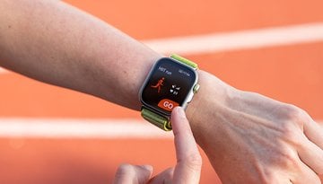
Yes, health and fitness remain central pillars—smartwatches have become wrist-bound wellness trackers—but let's not pretend every moment is a workout. Every so often, you just want to set a timer without digging through a maze of swipes, check a group chat meltdown on WhatsApp, or skip a podcast ad with a single tap. Wear OS 6 gets that. It doesn’t just look better; it feels smarter. The smartwatch is evolving beyond a fitness coach—it’s getting its personality back.
1. Wear OS 6 Finally Embraces Dynamic Color Integration
Android users will remember how transformative it felt when Google introduced system-wide color theming based on your wallpaper—yes, the very feature Apple “borrowed” shortly after. But for years, Wear OS lagged behind, stuck in a flat, utilitarian aesthetic that ignored all that expressive potential.
That finally changes with Wear OS 6. Now, your smartwatch UI will dynamically adapt its color palette based on your chosen watch face, echoing the personalization features Android phones have had for a while. This isn’t just a visual gimmick—it’s a cohesive design language that ties your devices together.
Google refers to this as dynamic color theming, and it’s not just limited to system menus. According to the Android Developers Blog, third-party apps and watch faces can also tap into the same palette. So in theory (and hopefully in execution), your favorite apps will start to feel more unified and visually integrated—less like a janky bolt-on and more like a true part of the Wear OS ecosystem.

2. Smooth Scrolling That Feels Like a Hardware Upgrade
Sometimes, it’s the little things—like scrolling—that make the biggest difference. In Wear OS 6, animations and transitions have been significantly refined. It’s not just about aesthetics anymore; the entire system feels more fluid and more intentional.
Scrolling now provides subtle cues, like visual indicators showing how far you are from the end of a list, giving users a better sense of context. Animations in the Quick Settings panel and throughout the UI use shape morphing and motion design to guide your attention and reinforce interactions. It’s not flashy for the sake of being flashy—it’s functional design doing its job quietly, but effectively.
- Also read: Google Pixel Watch 3 vs. Watch 2
Together, these updates make navigation feel seamless, almost like the watch itself got a performance boost—without the need for new hardware. This is where software polish meets genuine usability, and it finally feels like Wear OS is catching up to the promise of a premium smartwatch experience.
3. Glanceable Info in Wear OS 6 Actually Makes the Watch Useful
On a device with a limited screen real estate, clarity, and speed are everything. That’s the core philosophy behind Wear OS 6’s new “glanceable” interface—and for once, the buzzword isn’t just marketing fluff.
No, I didn’t get my hands on the developer preview, but based on official Google previews and Android Authority’s deep dive by Adamya Sharma, the improvements are clear. Navigating the UI feels faster, cleaner, and more intuitive, with smarter placement of frequently used actions and bite-sized info blocks that don’t require endless tapping.

Apps like Google Maps now surface your saved locations more quickly. Media controls are more accessible and better organized. Even the contact's profile screen got a thoughtful redesign that surfaces options you actually need, instead of burying them under vague icons and bad decisions.
The entire experience leans hard into usability—real, practical usability. It’s not about doing more. It’s about doing what matters, faster. And honestly? That’s exactly what a smartwatch should be doing in the first place.

4. Gemini AI Comes to Wear OS—Sort Of
On May 13, Google quietly confirmed that Gemini is making its way to Wear OS smartwatches. Strangely, it didn’t get a single mention during the 2-hour Google I/O keynote, which either means it’s not ready for prime time—or someone at Google forgot smartwatches exist.
From what I understand, Gemini will offer some degree of system-level integration. Initially, it will also require an internet connection to function. In other words, we’re not getting a fully integrated AI agent on the wrist just yet—Gemini is shaping up to be a lightweight, context-aware assistant designed to enhance interactions across Google’s ecosystem.
In theory, Gemini will offer smarter, on-device assistance by working alongside other Google apps—surfacing relevant info and streamlining basic tasks. Sounds helpful… but also a bit underwhelming, given what AI assistants are promising elsewhere.
Personally, I’d love to see deeper integration. Imagine Gemini cross-referencing fitness data, calendar events, and even your location to offer proactive wellness insights or genuinely useful suggestions. But for now, it’s more like a smarter input-output layer than a full-fledged AI companion.
And honestly, with Sam Altman and Jony Ive reportedly cooking up a sleek, AI-native wearable, it might be time for Google to rethink Gemini's role. Because in its current form, it’s just another voice-assistant on your watch—and that’s not exactly futuristic.

5. Wear OS 6’s Battery Gains Are the Underrated Win
All of the improvements in Wear OS 6—new animations, glanceable info, dynamic theming—are welcome, but they also put extra pressure on hardware. So when Google claims a 10% battery efficiency gain through OS-level optimizations, that’s… actually impressive. It suggests they’re not just focused on surface-level polish, but on delivering a more sustainable, usable smartwatch experience overall.
Of course, we’ll need real-world testing to see if that claim holds up, but it’s a promising sign that performance and longevity are finally being taken seriously.
Final Thoughts…
Wear OS 6 is still in active development, currently available as a developer preview. Google says the public release will arrive “by the end of the year,” which could complicate the launch timing for the Pixel Watch 4—expected around August 2025. That timing mismatch might frustrate some early adopters, but it also gives Google time to fine-tune the experience.
It’ll also be interesting to see how Google’s hardware partners—Samsung, OnePlus, Mobvoi, and others—adopt and implement these changes. The fragmentation has always been a challenge, and Wear OS 6 might finally be the version that brings some cohesion to the platform.
- Also interesting: OnePlus Watch 3 review—a solid all-rounder, but not for everyone
Overall, I’m into what Google’s doing here. The UI is smarter, the UX is tighter, and even if the Gemini integration still feels half-baked, it’s a step in the right direction. I’m cautiously optimistic. What about you?
Source: Android Developers